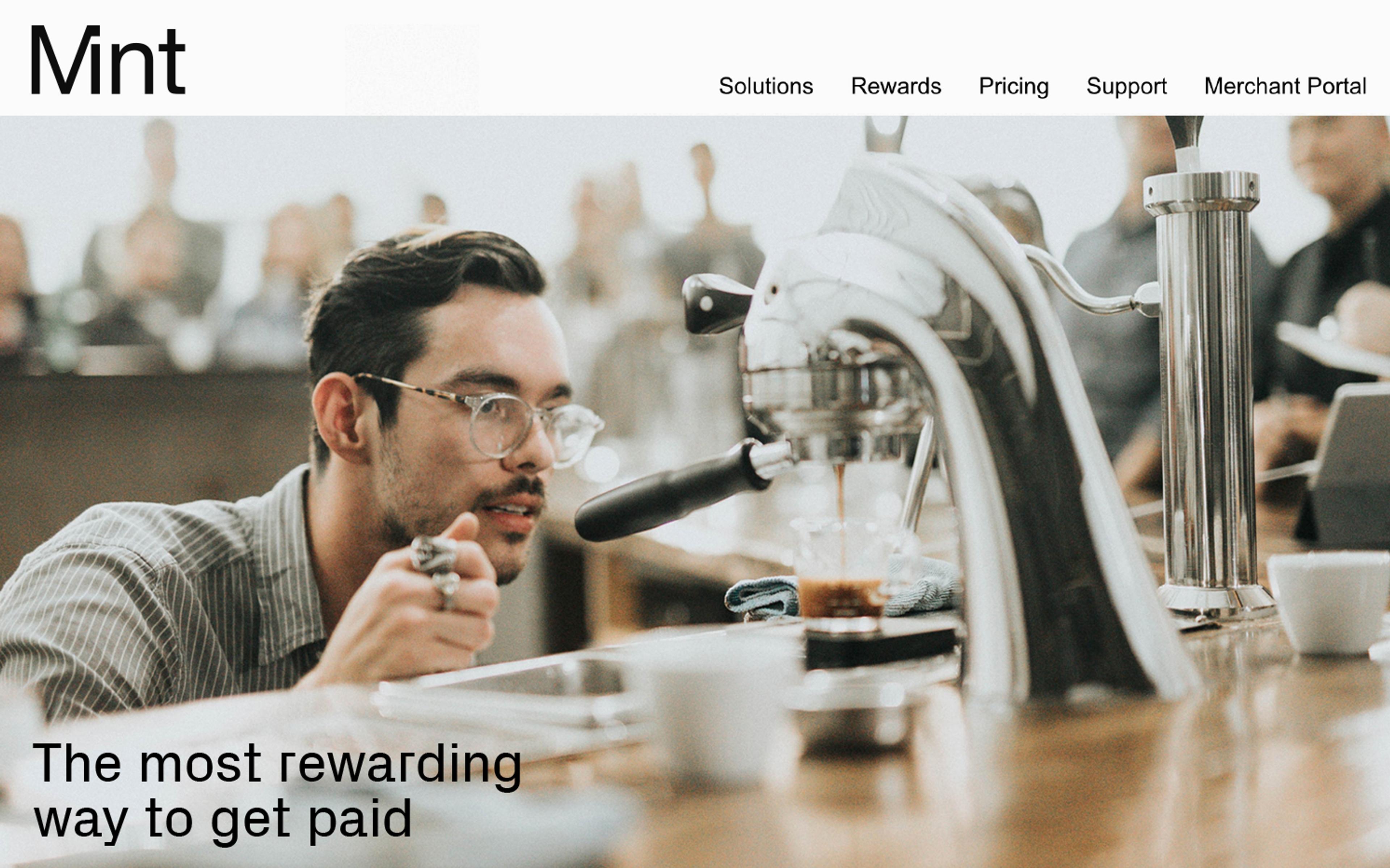
Mint is a publicly listed fintech company that helps companies of all sizes transact in more rewarding ways — whenever, wherever and however they want to pay.
Following a renewed strategic positioning, purpose and update of key verticals, M35 was called in to help re-imagine the brand’s identity through this new lens.
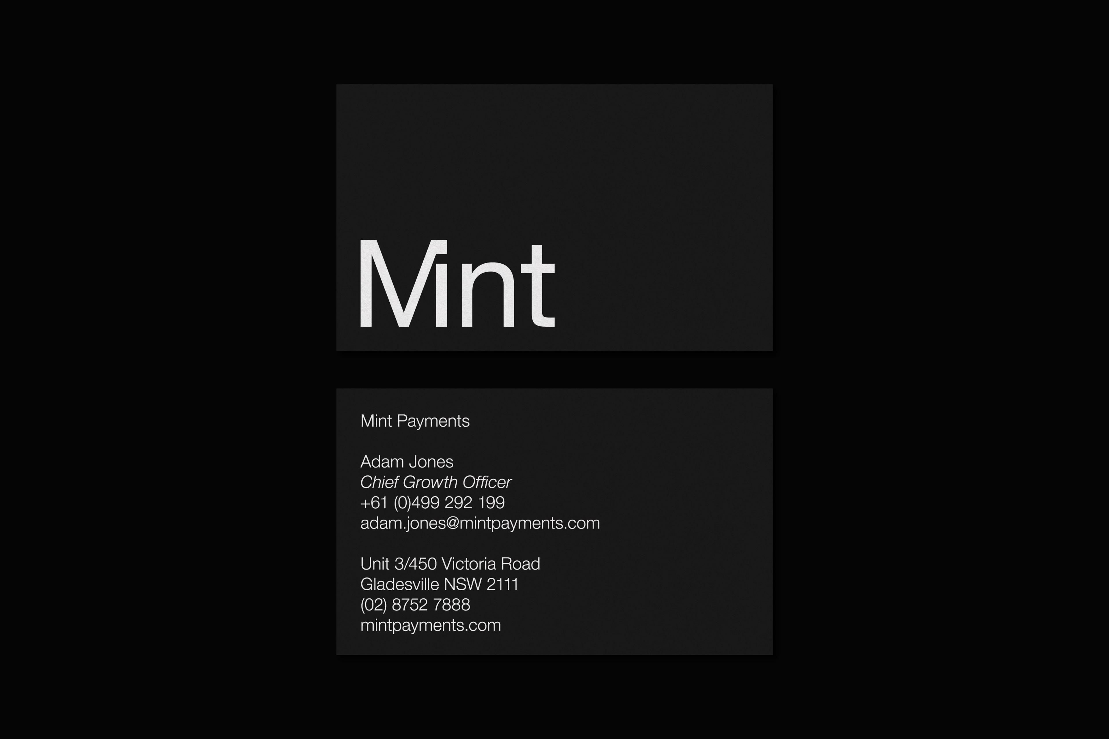
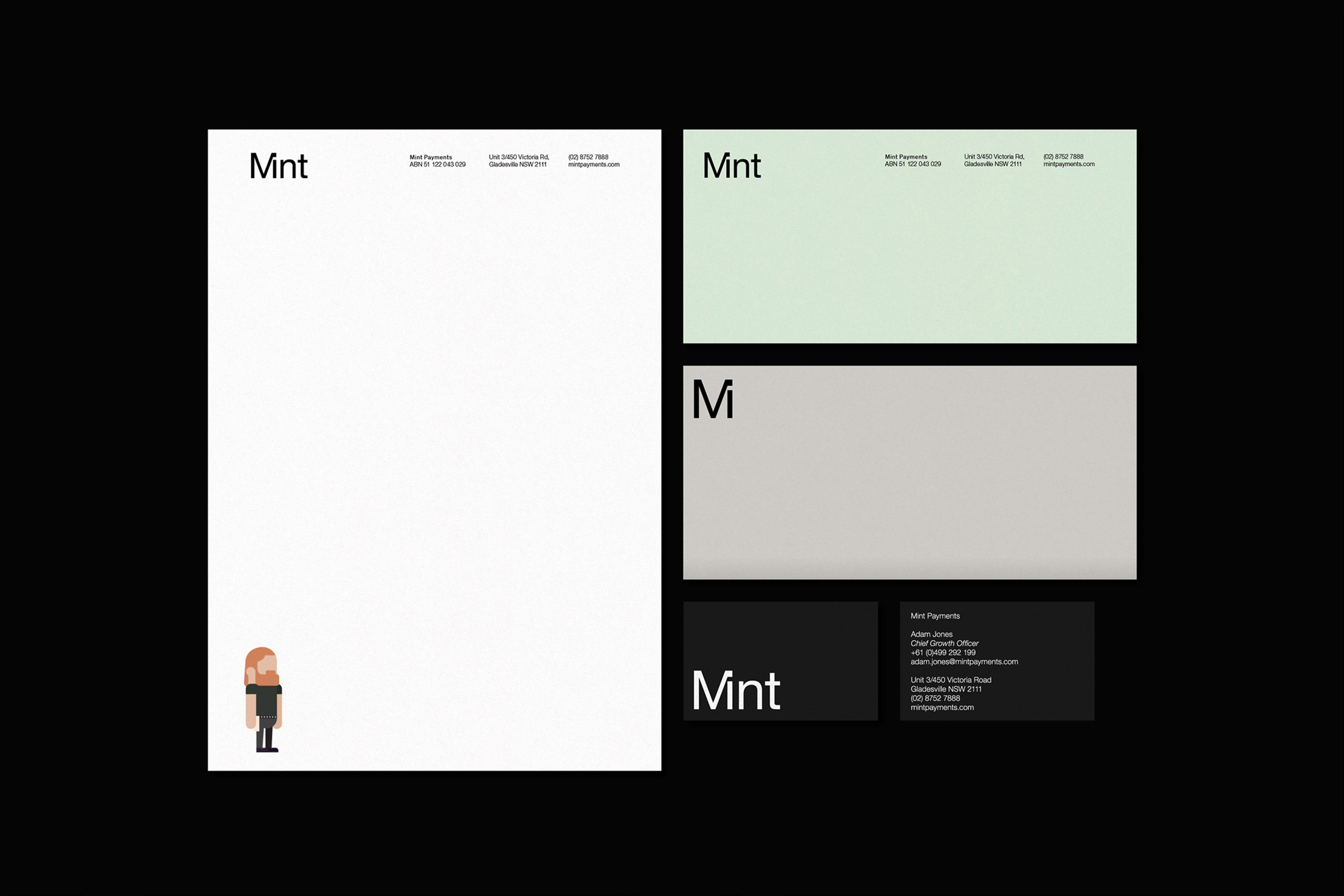
The word mark is designed to communicate the simplicity and speed experienced when using Mint Payment. Expanding out from this the wider brand system is aimed at humanizing the brand and making it feel more accessible, playful and rewarding.
The identity system is built in such a way as to allow brand stretch across the different customer touch points; from formal and serious to playful and human.


Mint
Client
Mint Payments
Partners
Strategy: Modern Equivalent
Illustration: Ben Toupein
Photographer: James Green
Category
Art Direction
Identity
Design
Website
Tech
Corporate
M35