After five decades the Australasian Writers and Art Directors Association (AWARD) decided it was an opportune time to reimagine the visual identity so that it not only better reflects AWARDS incredible heritage, but also demonstrates their future-focused philosophy.
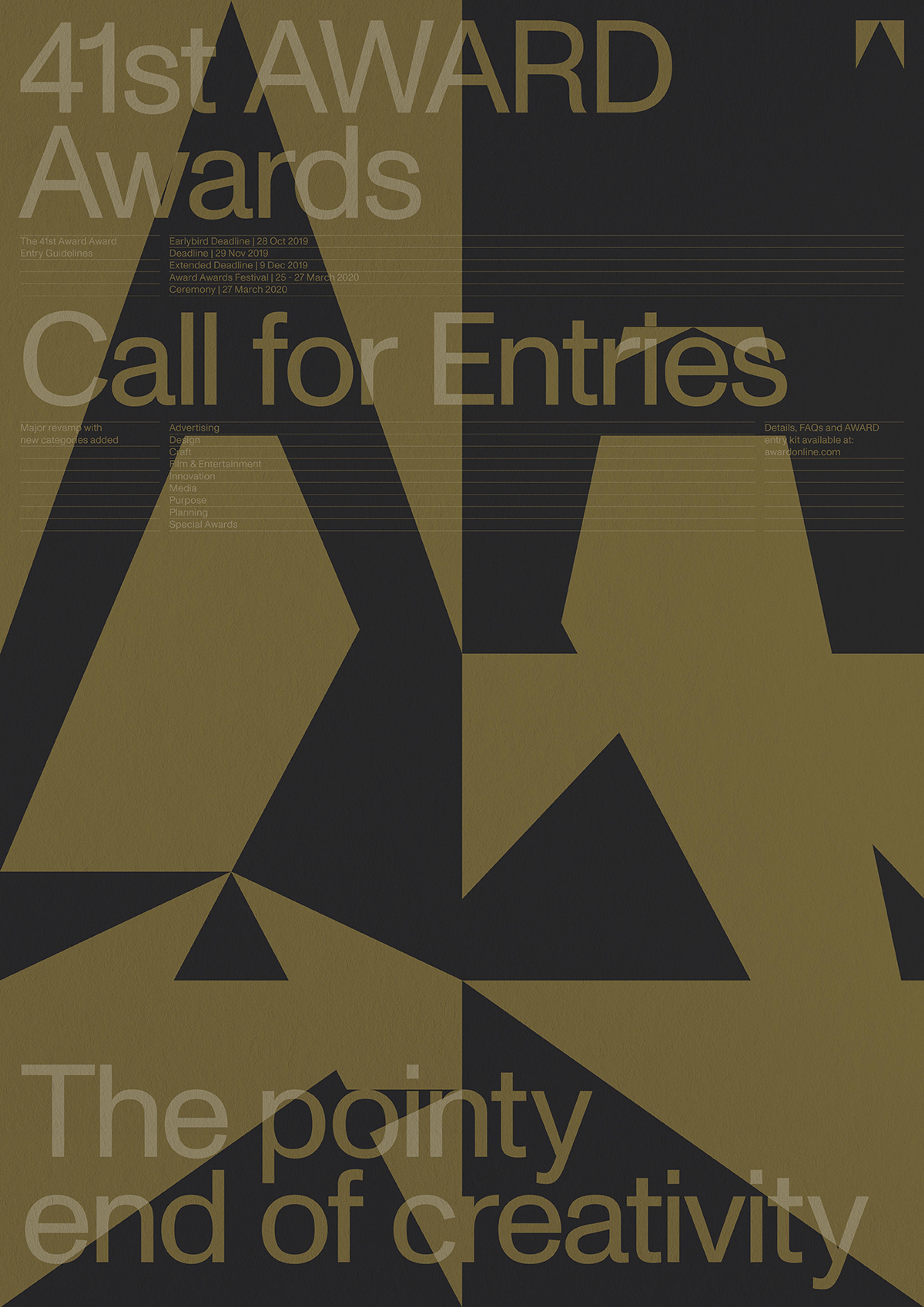
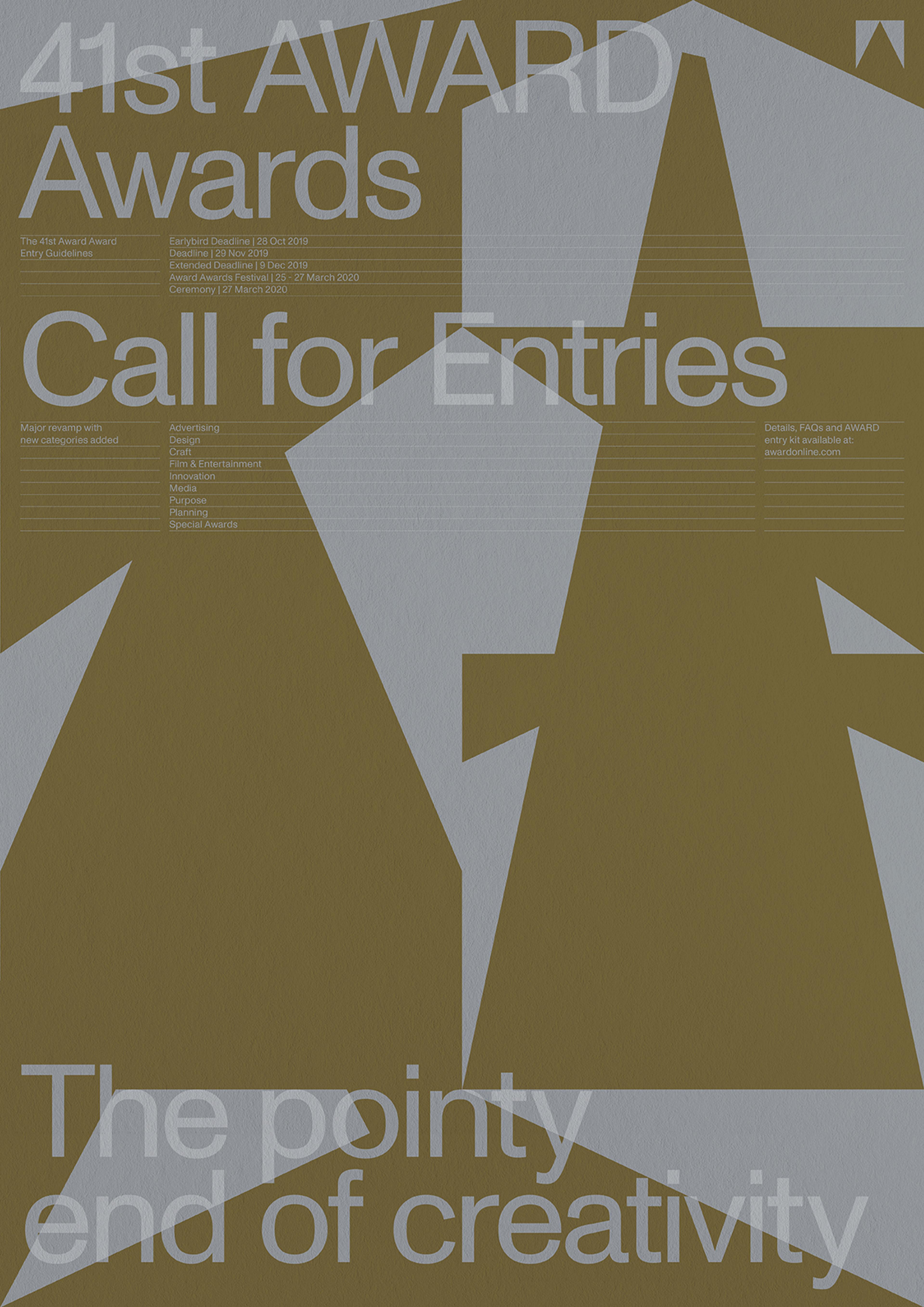
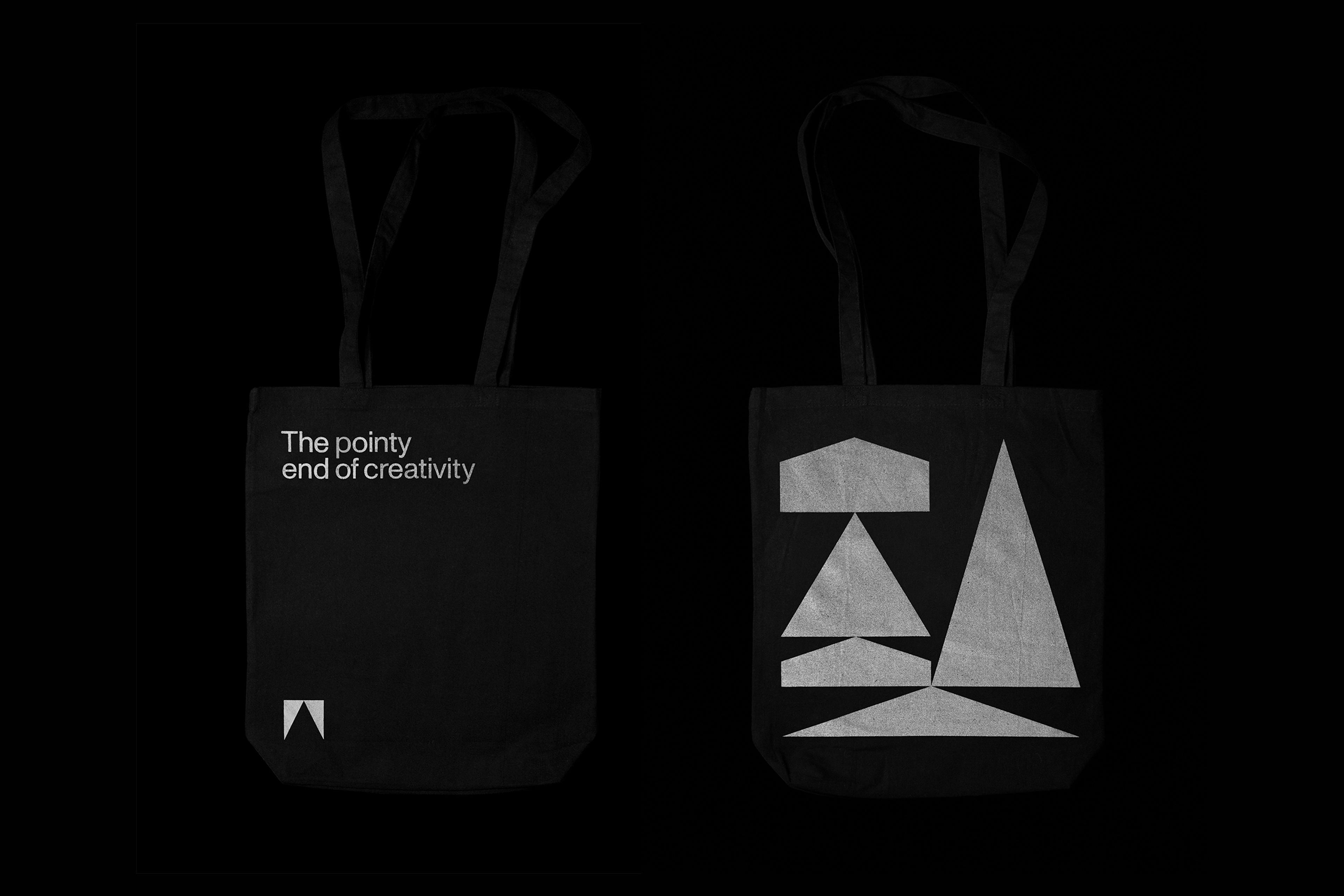
M35 worked alongside the AWARD board to develop the brand strategy and visual identity. After a series of consultative sessions the strategic positioning of “The pointy end of creativity” was developed as the key outcome that encapsulated the spirit of AWARD, and laid the story platform for the design of the brand identity system.
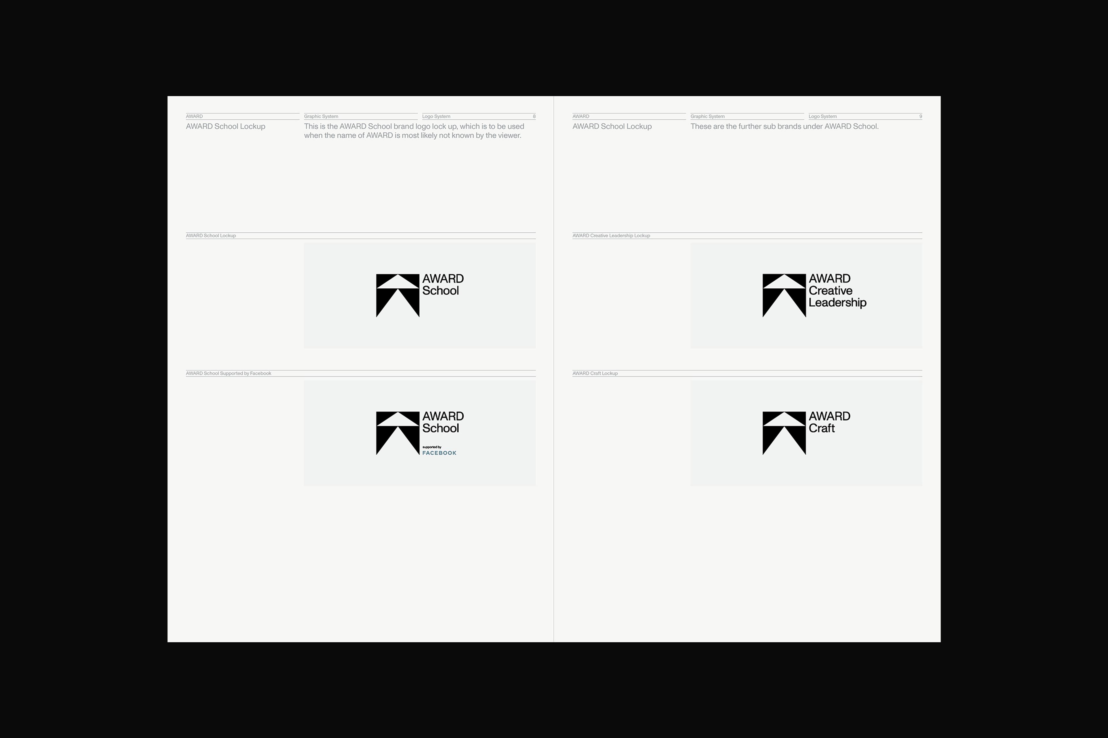
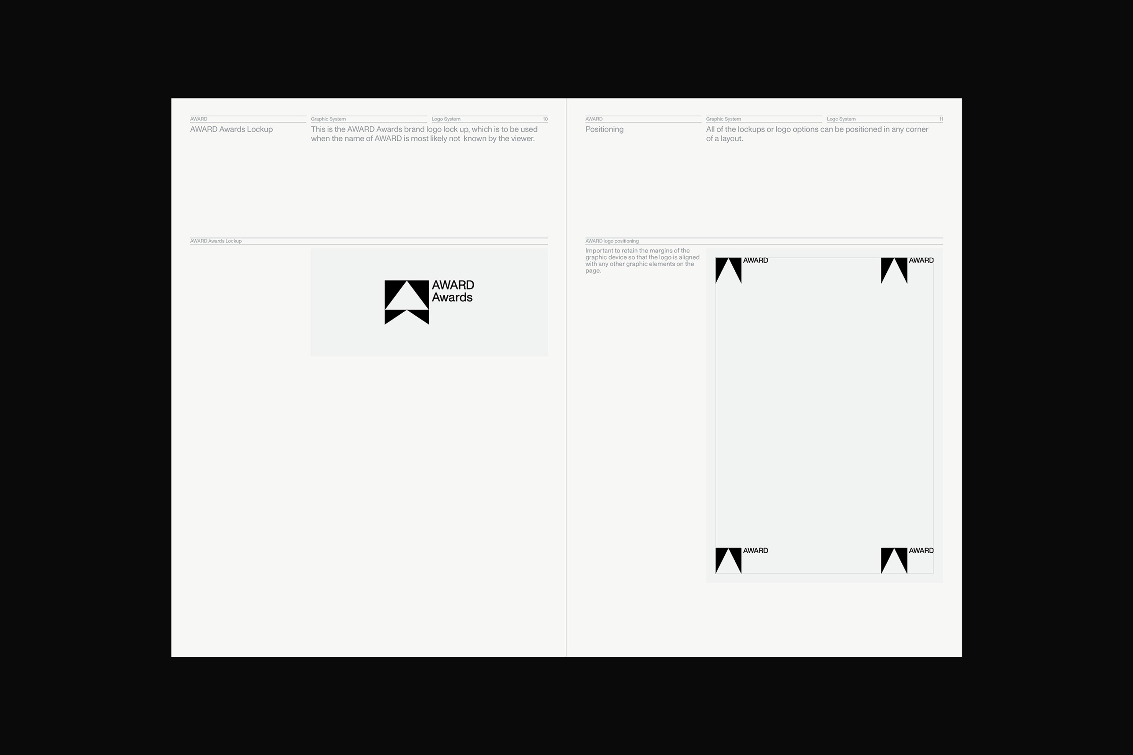
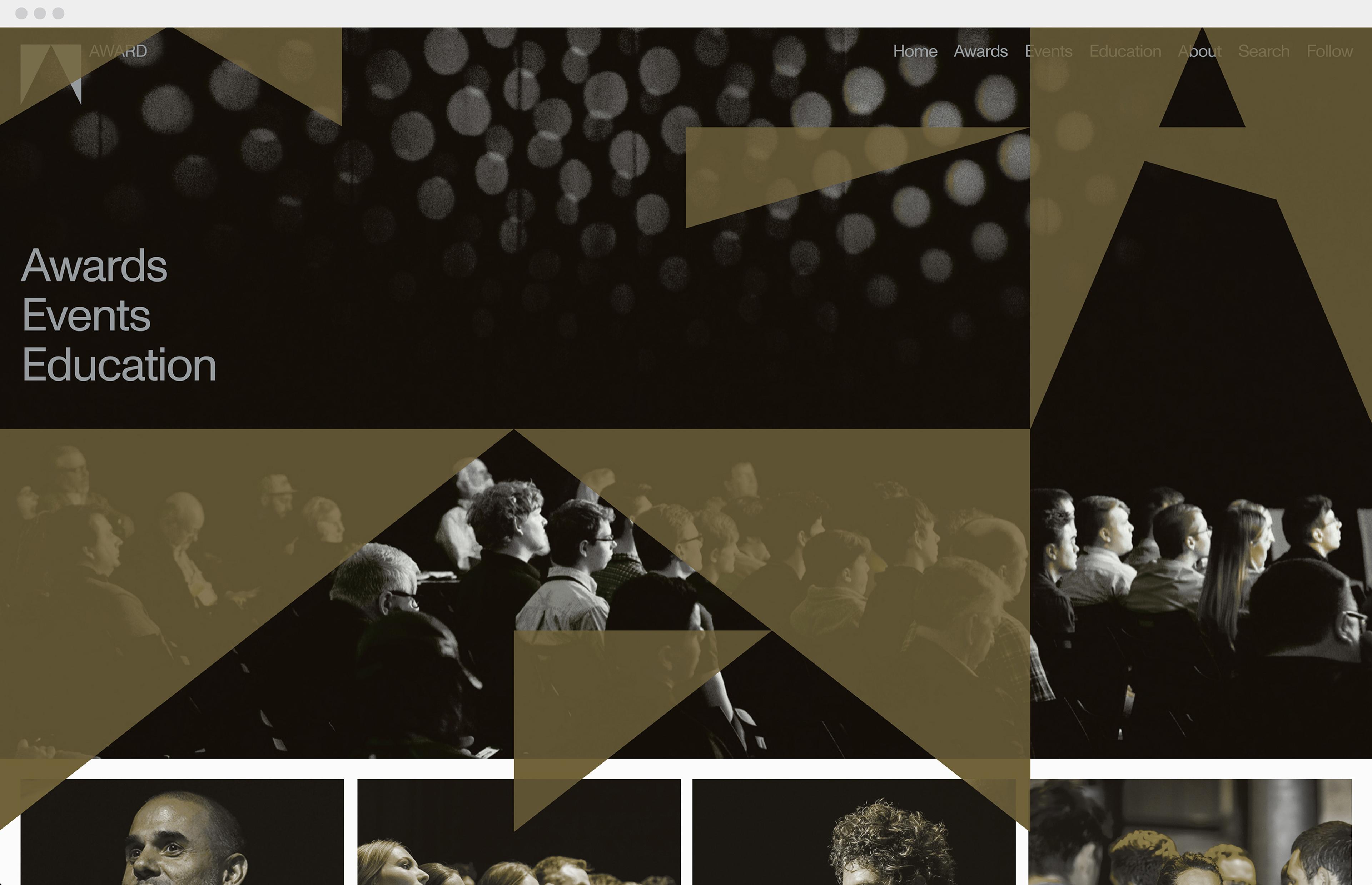
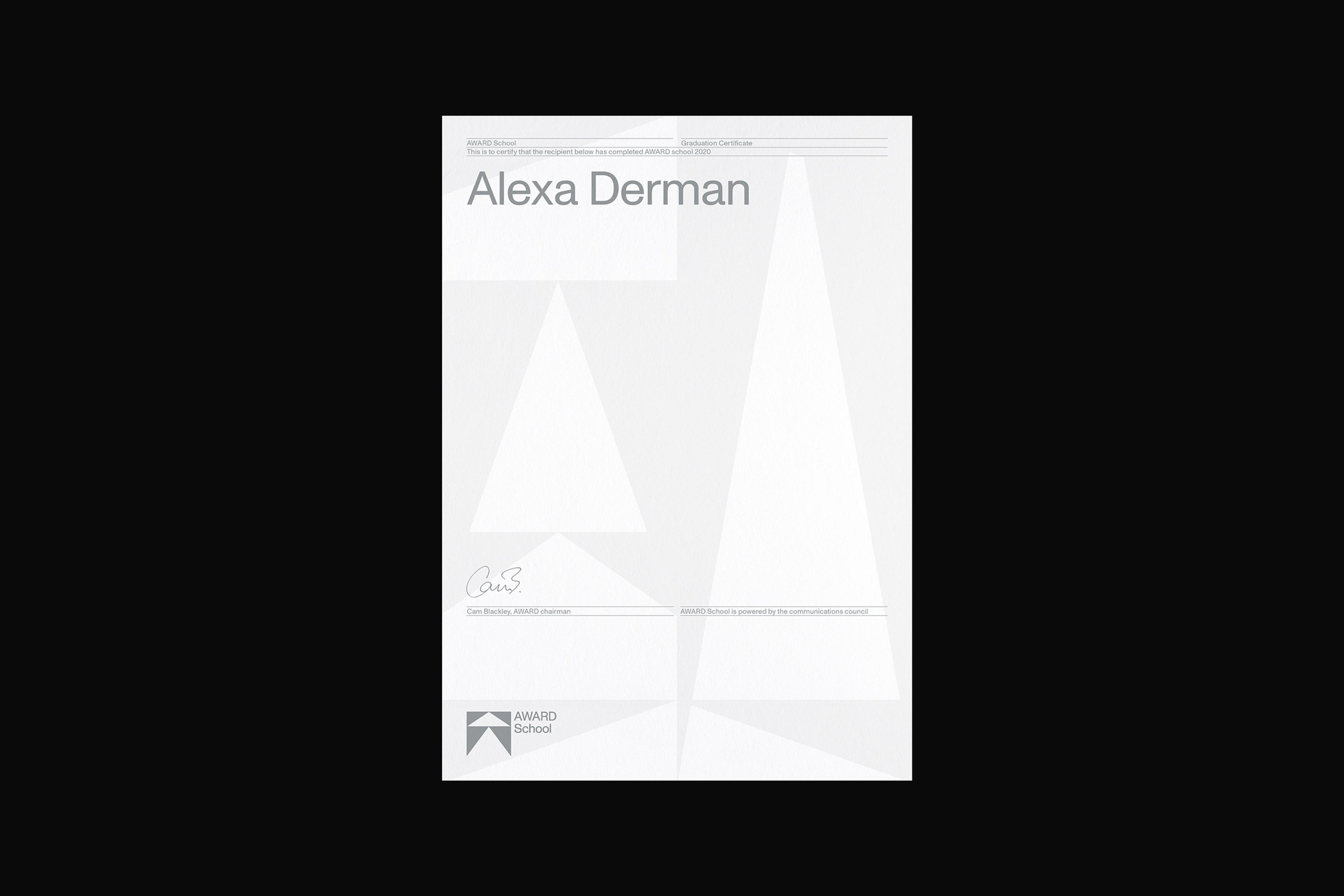
The new visual identity includes an entirely reimagined design system that provides AWARD with the ability to adapt and change across different channels and touch points; maximising brand impact, flex and recognition.
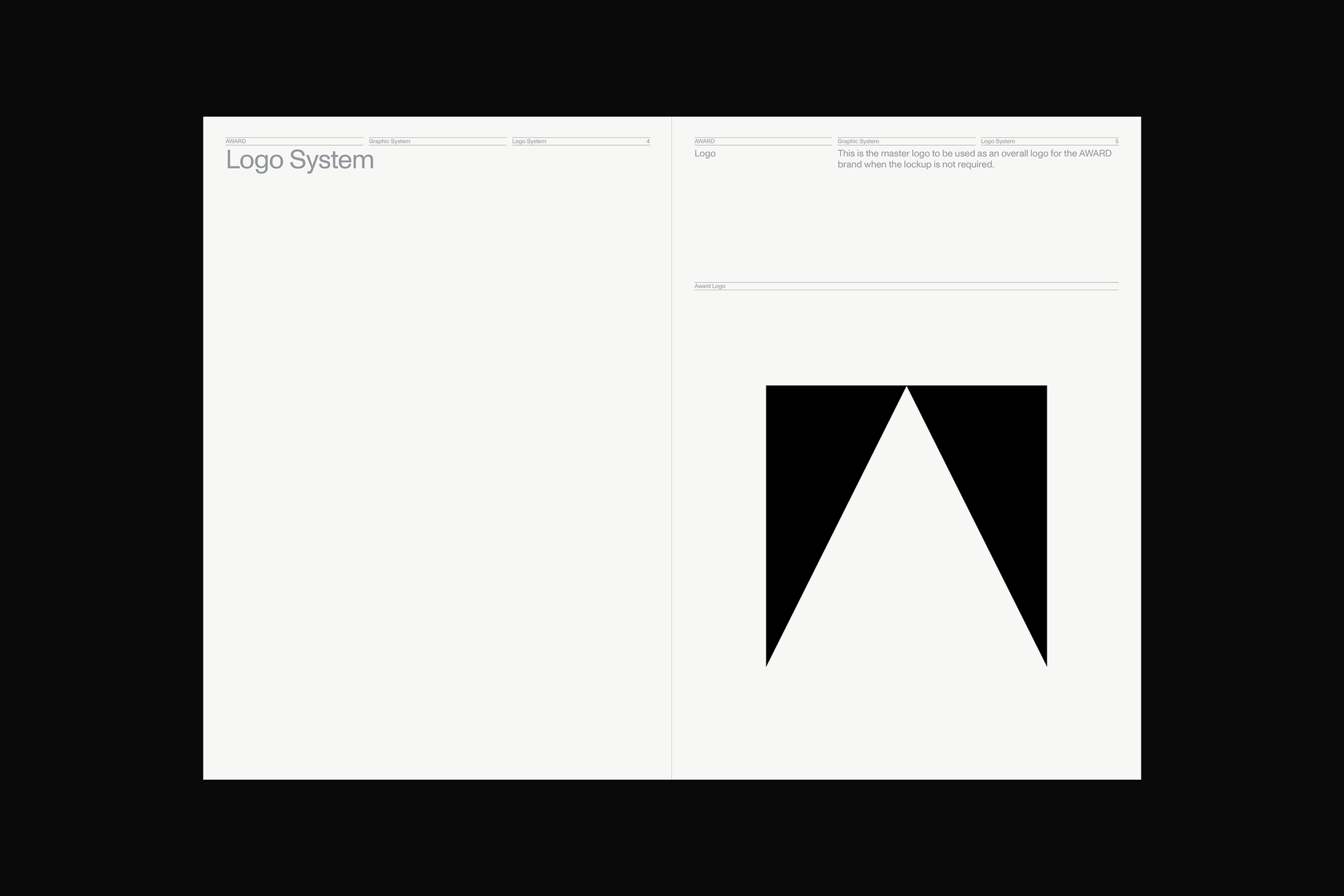
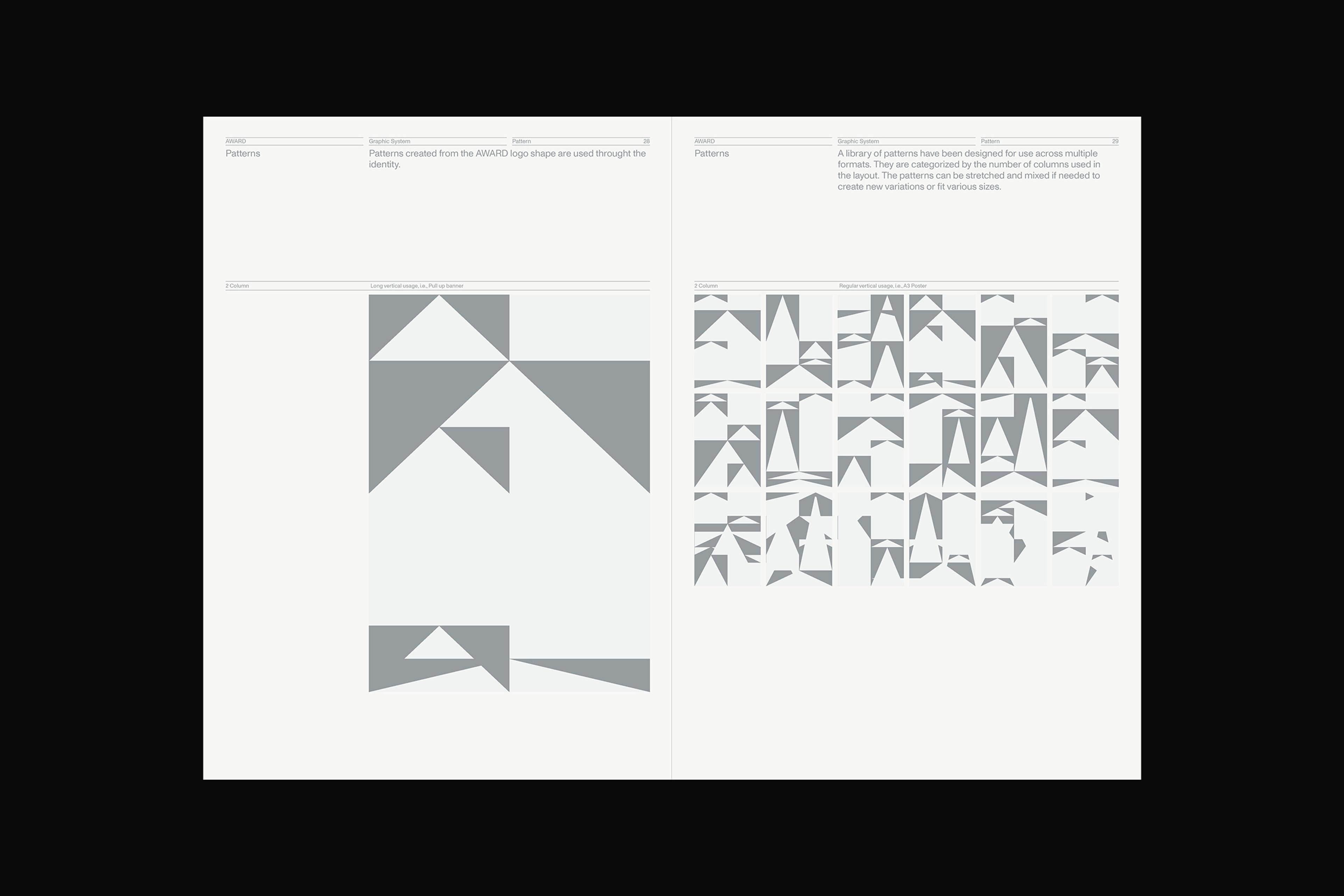
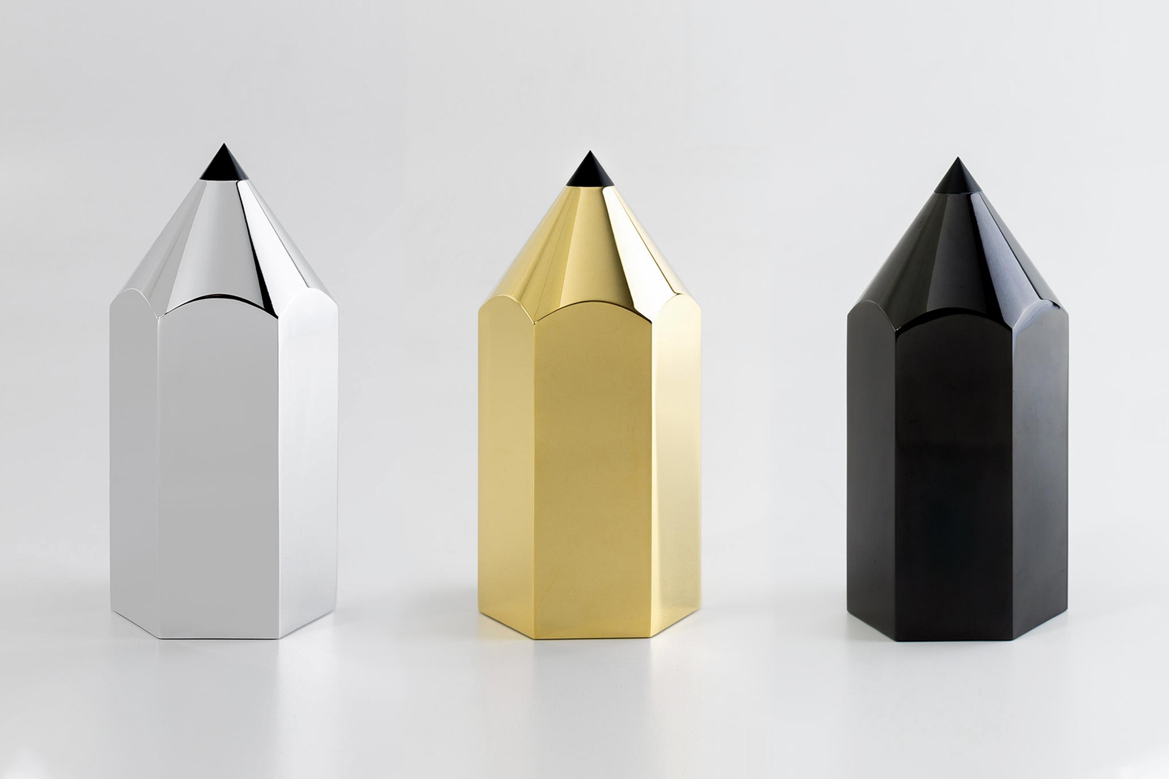
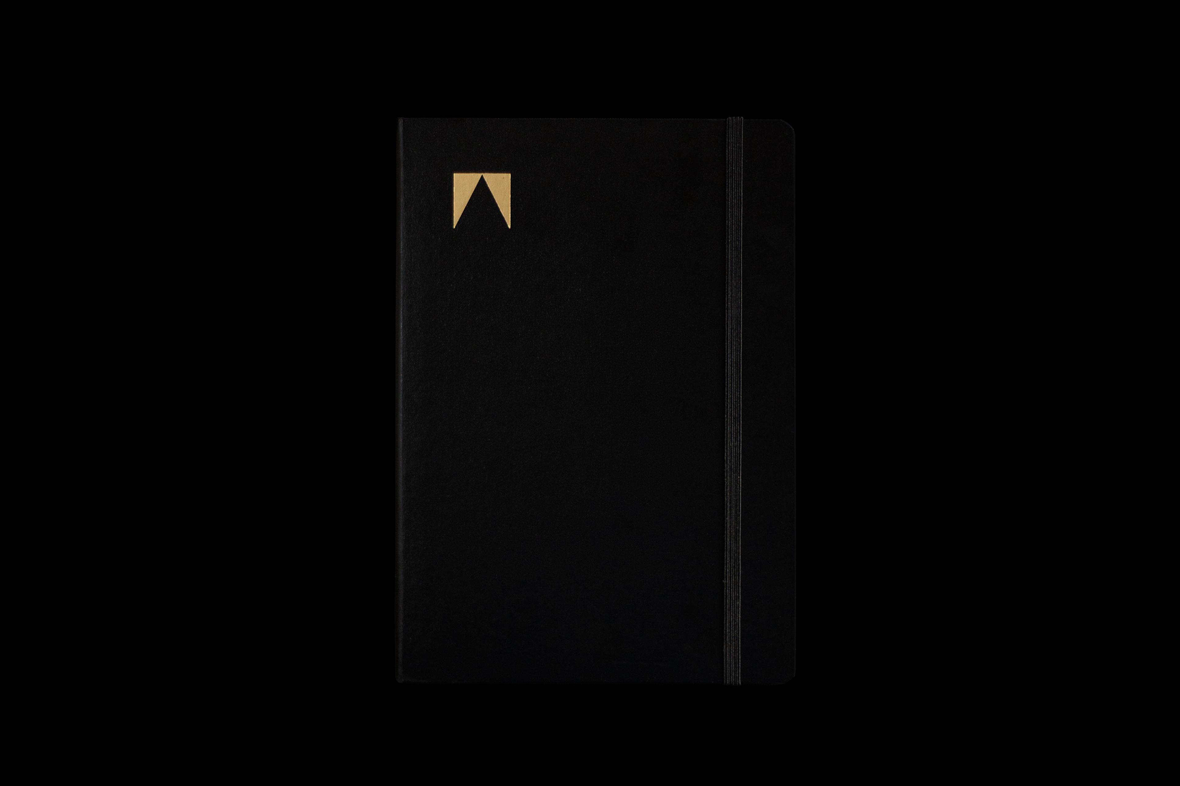
With a sharp upwards point reflecting both the AWARD Awards gold pencils and symbolising a capital A for Award, the new logo for the organisation represents its brand positioning as ‘the pointy end of creativity”. The triangular shape of the logo also informed the secondary brand language which are the result of overlapping fields of triangular shapes always moving upwards towards the pinnacle.


Award
Client
The Communications Council
Partners
Motion: Never Sit Still
Sound: Smith & Western
Category
Art Direction
Identity
Outdoor
Event
Design
Website
Digital
Motion
Branding
M35